* 영어를 배우면서 공식 문서를 보면서 styled component를 사용해 보세요.
예 배운 내용을 기록하려면
*태그된 템플릿 리터럴
-“의 값을 구문 분석할 수 있습니다.
– 템플릿 리터럴을 사용하여 함수 인수 구문 분석 및 전달
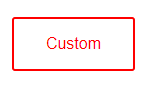
Styled라는 함수는 구성 요소를 반환합니다.
  const CustomBtn = styled(Button)`
    color: red;
    border-color: red;
  `;
<CustomBtn>Custom</CustomBtn>
* 주의
Styled-component는 렌더링 공간에서 선언하면 안 됩니다.
: 다시 렌더링할 때마다 새 항목이 생성되므로 비효율적입니다.
import React from 'react';
import styled from 'styled-components';
const Wrapper = styled.section`
padding: 4em;
background: papayawhip;
`;
const Title = styled.h1`
font-size: 1.5em;
text-align: center;
color: palevioletred;
`;
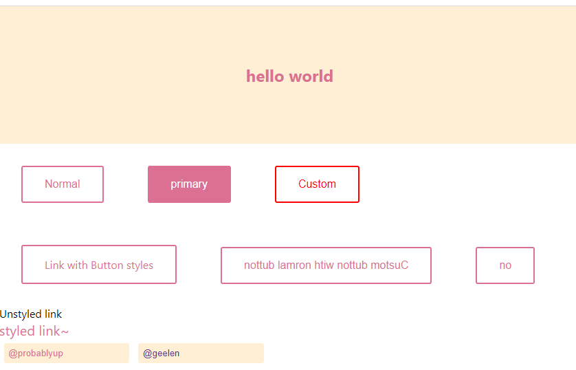
// @@ props 전달
const Button = styled.button`
background: ${(props) => (props.primary ? "palevioletred" : "white")};
color: ${(props) => (props.primary ? "white" : "palevioletred")};
font-size: 1em;
margin: 2em;
padding: 1em 2em;
border: 2px solid palevioletred;
border-radius: 3px;
`;
// @@ extending styles - (일종의 상속?)
const CustomBtn = styled(Button)`
color: red;
border-color: red;
`;
const ReverseButton = (props) => (
<Button {...props} children={props.children.split("").reverse()} />
);
const propsChildrenButton = (props) => (
<Button children={props.children.includes("c") ? "yes" : "no"} />
);
const Link = ({ className, children }) => (
<a className={className}>{children}</a>
);
const StyledLink = styled(Link)`
color: palevioletred;
font-size: 20px;
`;
const StyledLinkMent = (props) => (
<Link children={"Styled Link!"}></Link>
)
const Input = styled.input`
padding : 0.5em;
margin: 0.5em;
color: ${props => props.inputColor || "palevioletred"};
background: papayawhip;
border: none;
border-radius: 3px;
`
const Example = () => {
return (
<>
<Wrapper className="title">
<Title>hello world</Title>
</Wrapper>
{/* Extending styles */}
<div>
<Button>Normal</Button>
<Button primary>primary</Button>
<CustomBtn>Custom</CustomBtn>
<br></br>
{/* 다형성 - poloymorphic
- as 를 사용하여 구현 */}
<Button as="a">Link with Button styles</Button>
<Button as={ReverseButton}>Custom button with normal button </Button>
<Button as={propsChildrenButton}>
Custom button with normal button{" "}
</Button>
</div>
{/* Styling any component */}
<div>
<Link>Unstyled link</Link>
<br></br>
<StyledLink>styled link~</StyledLink>
<br></br>
</div>
{/* Passed props */}
<div>
<Input defaultValue="@probablyup" type="text"></Input>
<Input defaultValue="@geelen" type="text" inputColor="rebeccapurple"></Input>
</div>
</>
)
};
export default Example;
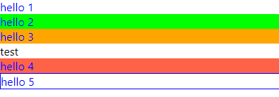
가상 선택
import React from 'react';
import styled from 'styled-components';

const Thing = styled.div.attrs(() => ({tabIndex : 0}))`
	color : blue;

	&:hover{
		color:red;
	}

	& ~ & {
		background: tomato;
	}

	& + & {
		background: lime;
	}

	&.something {
		background: orange;
	}

	.something-else & {
		border: 1px solid;
	}
`

const Pseudoelements = () => {
	return (
		<div>
			<Thing>hello 1</Thing>
			<Thing>hello 2</Thing>
			<Thing className="something">hello 3</Thing>
			<div>test</div>
			<Thing>hello 4</Thing>
			<div className="something-else">
				<Thing>hello 5</Thing>
			</div>

		</div>
	);
};

export default Pseudoelements;